
Helping a furniture producer design a user-friendly online platform to affirm its digital brand and support the work processes of its teams.
ABOUT
Based in the Bavarian countryside, Zeitraum is a high-class furniture producer driven by sustainability, manufacturing quality and the people present in its ecosystem. To manifest these values in its online experience, the internal team approached gravity to shape the next iteration of their website while solving issues in usability and desirability.
The Zeitraum web page is not only a portal through which the public gets to know the brand, the company and its philosophy. Its core utility lies in providing information, inspiration and products for end-customers, architects, press, investors and dealers.
UX REVIEW / INFORMATION ARCHITECTURE / BRAND FILTER / USECASES / WIREFRAMING / INTERFACE DESIGN / INTERACTION DESIGN / HIGH FIDELY PROTOTYPING / SPECIFICATION
PROBLEM
At the beginning of the process, we agreed to keep the main interaction principle of scrolling and not change the content displayed on the website. Therefore one of the core challenges of the project was to restructure and simplify the complex site architecture and flow, without losing any key part of the original Zeitraum’s website.
PROCESS
After studying the website and its issues from a data perspective, we dived into Zeitraum’s brand values, vision and mission. The only existing brand material was a print style guide, so we created a brand filter to define interaction guidelines, shape the design direction and maintain the strategic positioning in all phases of the project.
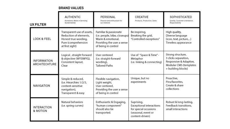
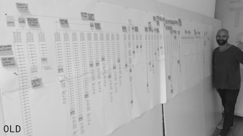
For our analysis, we mapped out the information architecture by visualising the old sitemap. This work was the foundation to identify pain points in the architecture and navigation. While designing the new site architecture, we explored different layouts and navigation patterns. Additionally, we designed new navigation principles that adapt to the context of information and user behaviour and therefore only provide what’s needed in a particular situation.
SOLUTION
The combination of certain categories, the re-organisation of related facts and the prioritisation of information resulted in a highly simplified information architecture that allows for easy comprehension on all devices and for all user types. New sorting solutions and filter options enable users to access anything with less than 3 clicks separation – no matter if on mobile, tablet or desktop computer. Consistent navigation patterns allow quick overview and access – therefore control – by being content-sensitive and adapting to the user's flow.
CONCEPT
Together with the Zeitraum team, we identified the different website users and their main cases of use. This work shaped our understanding of the users’ needs and guided the creation of tailored paths in the design phase.
For these users, their individual paths start all at the heart of the website: the product and project pages. Dealers can use the site as a selling tool, allowing them to consult, offer, “show and tell” in showrooms and at fairs. On the other hand, architects can browse the project pictures to draw inspiration and security or inform themselves about specifications, to just name a few.
PROBLEM
Another challenge that we encountered was to simplify the layout and flow of information. The old site had problems in its accessibility: it didn't provide clear layouts or easy to understand key information, nor distinct call to actions. Navigating was confusing and often frustrating for the users.
PROCESS
Through wireframing we created a system of consistent templates that allowed a rapid CMS setup for mobile and desktop to be able to keep the focus on the most important assets, the pictures. We sketched on paper from outside-in, defining first containers, then modules and elements. Wireframing was also a tangible basis to discuss filter, sorting, interaction principles and grid behaviour. The wireframes and flows produced were an appropriate foundation for evaluation and testing with the Zeitraum team before the design of final graphical assets. These helped us make sure we were providing a clear hierarchy and that the key information and flows were easily comprehensible.
SOLUTION
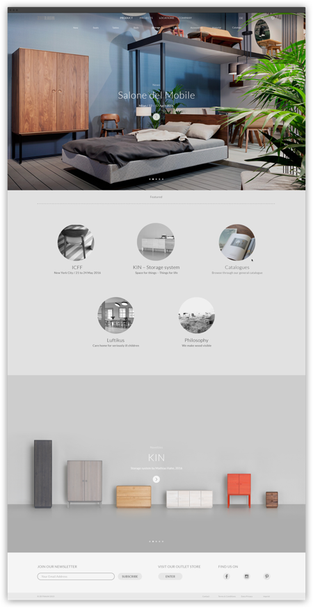
We designed the products and projects overview pages in a way that invites for fast browsing on low hierarchies, by incorporating an expressive on-page preview. The overview page uses motion to guide the user to the most necessary information, providing orientation, giving immediate feedback and fostering desirability.
On the specific product and project pages, we focused on an emotional content experience with large pictures, full-screen gallery and mobile-friendly information. Put in context with projects and product family, it creates a rich and informative experience.
We designed a new visual language that stays true to Zeitraum’s brand legacy and it’s easily replicable in the digital environment. The new visual system provides better contrast & size, legible typefaces, clear visual elements and consistent patterns beyond breakpoints.
CONCEPT
During the project the client briefing extended, adding the challenge of designing new ways for Zeitraum’s extended commercial team to connect with customers in personalised and meaningful ways. We created a working tool for dealers, agents and architects to collect and group together products and projects to better inform customers and enhance relationships through a tailored experience. The feature incorporates options to save, edit, share and send the project and product that the user has selected. People can either collect their favourite products in their specific collections for themselves or use it as a personalised selling option.

Timelaps of how to use the working tool.
As the only interaction designer on this project, I had three main responsibilities: be the project manager, create the user experience and visual design, and supervise the implementation process.
I led workshops, weekly team check-ins, client presentations and developer meetings.
Once our developer started implementing the website by setting up the CMS and the individual HTML pages & stylesheets, we regularly exchanged feedback to review, discuss, test and refine. Prototyping and feedback cycles shaped the website by making sure that everyone shared the same interactive vision.
Together with Zeitraum’s graphic designer, I developed a new visual language representing Zeitraum’s core values.
The power of prototypes, if chosen wisely.
When taking the client’s perspective, it can be hard to truly understand abstract design concepts in the UX phase. After having some trouble communicating navigation and user flow with static illustration diagrams, I realised that by using more tangible high-fidelity prototypes, or “experienceable concepts,” I could communicate so much better than I could with only static images.
Additionally, I used to strictly divide between b/w wireframes and visual design, therefore content and style. After fine-tuning all the wireframes to focus on the content, it was not a fun surprise to figure out that the client didn’t really like the first version of the look & feel we had designed.
Being in charge of both, it can be a timesaver to combine wireframing and visual design methodologies earlier on to enrich the client’s understanding of the work been done.
A flexible live-mixing tool for sound engineers that enables better interaction possibilities and more efficient workflows.
A data visualisation that turns guitar licks and the guitarist's dynamics into light constellations, in real time.