The only way to learn is to do it: exploring possibilities and raising questions through prototyping.
DIGITAL PROTOTYPING
2016
AT GRAVITY
TRY THEM LIVE BELOW
ABOUT
I always dreamt of finding a tool that empowered me to become a magician of experiences, helping me provide users with digital prototypes that look and feel real, so to get an honest reaction and not a considered feedback. You can imagine how thrilled I was when I discovered Framer, that soon became my weapon of choice for both idea and user testing. In digital spaces, Framer allows me to create prototypes that behave like the real deal. This doesn’t end with creating a mobile app, it allows me to explore environments of products, services and user feedback. I can create IoT services, connect to hardware, create a proper cloud or even work with chatbots and AI. Of course, those options are available for a while, but not to designers like me, and surely not in a way that makes it manageable in a few hours to an extend that feels totally real for the users. Framer enables me to quickly create the user experience I had envisioned, without any detours. Plus, it puts me closer to the user. That's why I feel like a magician and its a hell of a lot of fun.
HIGH FIDELITY PROTOTYPING / EXPERIENCE PROTOTYPING / USER TESTING / EVALUATION / PROGRAMMING / IoT

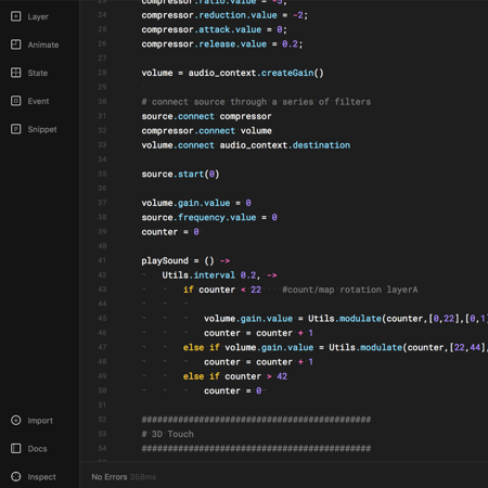
Using a phone to increase mindfulness might sound like a crazy idea. As a side project, I wanted to find ways for people to calm down or increase awareness with easy and simple tasks, not with guided meditations. My challenge was to explore types of interactions to become more mindful. Research shows that with slow, continuous and gentle body movements, people can connect with themselves better, moment by moment. I had some ideas about how to create a framework to amplify people’s own thinking and decided to build them all to test my assumptions. I explored input and feedback mechanisms, each involving different senses. Interestingly, sound and haptic senses stood out as guiding principles because they are parallel senses/interfaces, not in need of a lot of cognitive power like our visual sense. This was an essential insight because it allowed me to focus on the experiences in which people had a greater balance between paying attention to the guide and to their body and mind.

A Mindful Interaction prototype. Breathe along here.
The tested concept aims at helping people build awareness by training the ability to voluntarily pay attention. On the simplest level of the concept, the user only needs to breath along the animation, respecting the time suggested by the animation itself. As a second step, the app recognises and visualises also the users’ breathing pattern, helping people slowly matching their breathing pattern to the initial animation. As the access with getUserMedia (for microphone access) to prototype for voice interfaces is still very limited, especially on iPhone, I had to simulate it. By switching to 3D Touch, I could at least dynamically communicate how it would sound and feel like. On the third and last step, the user can finally close his/her eyes and by feeling a vibration pattern he/she can breath according to it. Here I had to fake it once again by using sound feedback (sine wave with Web Audio API) since there was no way to access the motors. It’s vibrating though!
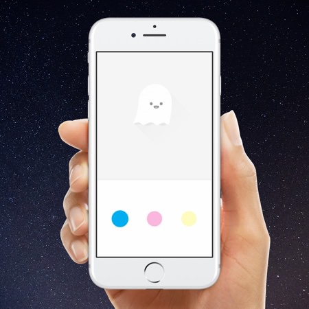
Mixing colours to obtain a precise result can be a challenge for kids. I had a simple idea on how to unusually apply colour theory, but the missing and most important bit was to make it fun and playful (and to make to work!). From the static design, I started exploring touch feedback by tweaking timings, properties and animation curves. Wobbly reactions of the circles after a touch looked fun. Being a fan of synesthetic experiences, I wanted to add sound. And what’s the most playful sound? Bubble wrap popping, bingo! Jumping right into the exploration of the “feel” in an implementable manner was fun and quick. I needed to connect the controls on the bottom part of the interface with the canvas (the top part) for a better mental model, therefore I fine-tuned a smooth animation that made the circles fly into the canvas, spreading with a blur.

The colour prototype. Play with it here.
The concept aims at changing the way children learn and think about colours. Instead of using color names, the app provides an interactive “equation” showing which primary colours, and what proportions of these, are needed in order to create a secondary color (the one shown on the top part). Above all, it also teaches color theory. Even though my algorithm is not refined, nor is the conversion to RGB, the concept is based on mixing real physical colours, therefore CMY(K). The equations help children understand some of the basic concepts behind color theory and how to mix and create new colours.
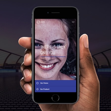
During the work of designing a microsite for a startup, I came across the need for a secondary navigation that had to feel light and easy. The problem was that on mobile, relevant content would spread across a long page. It was essential to provide the user with an overview of what to find below as well as with a quick way to navigate. With a little bit of high-fidelity prototyping, I could explore navigation solutions to access content on a longer page more quickly and easily. I designed a delightful anchor link navigation that is merging with its content once you scroll over it, or tap on the link. The prototype allowed me to test a hypothesis, collect valuable feedback and better communicate my concept to the client. The nature of code allowed a seamless handover to the developer for implementation, which saved lots of time.

The navigation prototype. Try it here.
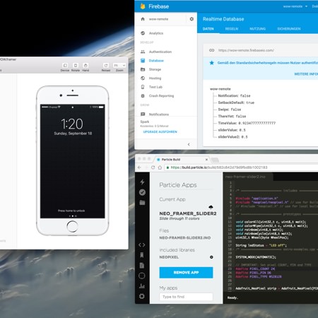
Prototyping service experiences can be done in very different ways, and digital experience prototypes can offer the magic bit. For a design thinking project, aimed at inspiring people to prototype and to kickstart discussions and development, I worked on connected prototypes. My challenge was to create the experiences that lived along side a storyline, and to incorporate both hardware and software elements. Googles Firebase allowed me to load and synchronise the prototype environment over its database. Together with Framer, it allowed me to refine multi-screen scenarios iterating with quick rounds of creation and validation. Firebase also allowed me to keep the devices aligned to the hardware side, a particle board equipped with a micro controller and WebIDE.

This is just a video of part of the prototypes, not an experience. Some are abstracted, some are tests.
Framer provided the platform to connect all elements of the experience. It functioned also as a remote to trigger elements in the experience story. The fact that the digital behaviours were actually working, made it feel authentic and at the same time magical. It provided a reference for what “buttery” feels like and helped me convince the team of my ideas. The project was setup in weekly design reviews and discussion rounds where Framer did a great job in helping me communicate interactions and experiences. The prototypes inspired the team to discuss and explore more as well as to reflect on their experiences with the prototype environment.
Exploring the power of motion in space: a geometric audio-reactive diptych visualisation.
A flexible live-mixing tool for sound engineers that enables better interaction possibilities and more efficient workflows.